Art Class Demos from Sept 2011-June 2012
This post shows class demonstrations I gave at the Oregon Society of Artists. I teach a Tuesday morning Watercolor class from 10am-1 and a Wednesday evening Drawing and Painting class from 7pm-9. These are images from both classes and are not posted in order.
We are on summer break right now.
Watercolor resumes Tuesday Sept 11, 10am-1 $20 drop in fee
Drawing and Painting resumes Wednesday Sept 12, 7pm-9pm $15 drop in fee
Contact me for more info at steve@stevekleier.com
click on images to enlarge
 |
| This was the last demo for this season. It was done from a small sketch I made from the Washington side of the gorge east of Washougal. I changed a few things that helped to capture the day. |
 |
| We used these objects to practice capturing proportions and relative placement . |
 |
| This picture was motivated by ideas about composition and color more than depicting a specific scene. |
 |
| This shows a ruin of a Roman fountain in Vienna. The composition is pretty true to the photo but the colors are changed. |
 |
| This was inspired by the same photo of Shoenbrun, but I used my imagination to radically change the viewpoint. |
 |
| Since I changed the view so much in the painting above I needed to make a study in charcoal first. |
 |
| This was done completely from imagination. Inspired, of course by the Oregon landscape. Just three colors. Burnt Sienna, Cerulean and Ultra blues. |
 |
| A vacation photo from M Porter of southern Italy. It is a modified one point perspective and secondary triad. (green, purple, orange. |
 |
| This shows a simple street scene in one point perspective and secondary triad. |
 |
| This busy street scene was done from a photo and required quite a bit of simplification. One point perspective. The weak shadows and colors give it a cool feel. |
 |
| Kingfisher done in watercolor |
 |
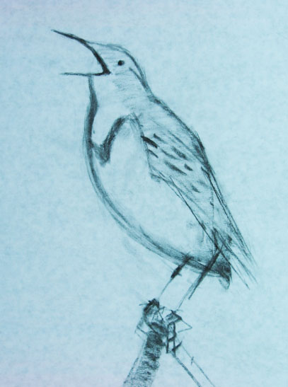
| We did these bird drawings to capture proportions and shape. |
 |
| One point perspective simple colors. Raw sienna, Cad red and yellow for the orange. Ultra blue and Alizarin for the violet. Cerulean in the sky. |
 |
| Downtown Hillsboro |
 |
| We showed the volume of these pots by rendering the shadow shapes. |
 |
| This painting was from a photo I took at the rhododendron garden. |
 |
| This is a copy of a painting by JZ. |
 |
| This is a plein aire painting I did out at Marine drive. It wasn't a demonstration but I thought I would include it because we often talk about painting outside. |
 |
| Here is a painting inspired by a photo but with a lot of interpretation. A simple two color pallet, Burnt Sienna and Ultra blue. |
 |
| A couple more two color paintings. Prussian with Burnt Umber and Alizarin with Viridian. |
 |
| These two drawings were done at the Wed night class. I used a photo with a grid to capture proportions and dark brown pencil and white conte on grey paper. |
 |
| We used this painting by Trevor Chamberlain as an example of watercolor impressionism to copy. Here it is with the charcoal study. |
 |
| Here is the finished watercolor. |
 |
| This one is about the sky. |
 |
| I cropped this photo to get the composition I wanted. |
 |
| This one was done from a video. |
 |
| We shook it up a bit with these cubist paintings colored with a secondary triad. |
 |
| This was a lesson in using warm and cool colors in the shadows. |
 |
| We used this image of the Dee River in Seaside for several lessons. |
|
These demos from the last couple classes show two different ways to approach a painting. In the first painting there is a lot of useful information. The buildings and bridge give us plenty of shapes to grasp and use for a composition. There is a lot of drawing on this one. The tree scene has very little drawing and relies almost entirely on texture and value/color to create the illusion of groups of foliage, grass, distant trees and sky.
 |
| This is the composition and value sketch for the above painting. The values are numbered 1-4. One is the lightest, four the darkest. |
 |
| This is a contour drawing with graphite wash |
 |
| Sanquine conte' with white chalk on blue paper |
 |
| Thanks for bringing in the saddle Kris. It was a good subject. Charcoal and white chalk on craft paper. |
 |
| This shows the hows of Free hand, Control hand | and the whats of contour and value |
 |
| This is a contour drawing and a value drawing done with control hand |
 |
| Oct 26. This is the demo. |
 |
| This was done for the Wed night D&P class. It shows drawing in value. The proportions were rendered from a photo using a grid system. |
 |
| Oct 25. I used a photo for this 1/2 sheet demo. But I changed it a lot to make it more satisfying for me. |
 |
| This is a small color study. About 5x7" |
 |
| Here is the composition/value study |
 |
| This is the full color version. |
 |
| Here is my painting from the set up. I use two colors. Raw Sienna for the color of light, ultra blue for the color of shadows. |
 |
Here is the photo of the still life we worked form this week
Here is another one point perspective. This was done from a photo and required quite a bit of simplification to make it managable. |
 |
| Sept 27. This painting shows one point perspective. |
 |
| This flower painting was the final demo from last year |
 |
| Using these three reference photos I created the painting below |
 |
The challenge here was to use three quite different reference photos in a composition. I used lines to do this as it makes the composition quite clear.
Demo from Sept 20
|


No comments:
Post a Comment